Representing Accessibility in the Arts

Who
RCA2022 visual identity was designed by Europa, by Robert Sollis and William Jacobson, both RCA alumni, with Kaiya Waerea and Sophie Paul, graduating students from the MA Writing programme.
Europa are a graphic design studio interested in all forms of culture. Europa work with a diverse set of cultural institution on projects including graphic identities, books, publications, exhibition design, signage, art direction and websites. Europa’s approach to design is collaborative – believing the constraints that a project brings can be both liberating and joyful.
Kaiya and Sophie were approached by Europa to give insight into producing a visual identity that holds valuable dialogue about accessibility in design practice at its centre.


Values
RCA 2022 has given us a chance to think about accessibility and inclusion within design; what does an accessible graphic design practice look like? What are the barriers faced by d/Deaf, disabled and neurodivergent students, and what provisions can design provide to meet them? How do we design for a future that does not aim to eradicate disability but respects and supports a diverse range of needs? What does this look like in the context of presenting student work?
Our priority within this process has been to challenge our assumptions about what ‘good’ design is and how it operates, with a view not only towards RCA2022 but how this can bleed into life outside of Kensington and Battersea. The blended modes of learning that we as students have operated within for the last two years have meant that design happens in both local and global arenas, physically and digitally, in our studios, bedrooms, kitchens. When we speak about disability justice, we do so with a view that whatever we were doing before has not been enough – it is our task to think about how design can produce vital new knowledges that challenge the norms and that looks towards a future that we want to see.

WiP
Creating the identity for the Work-in-Progress show was a catalyst in deciding to centre dialogue around access at the centre of the RCA2022 identity. The Work-in-Progress featured graphics that moved in and out of legibility, and from this we were faced with questions and challenges about the scales of legibility and image-making.
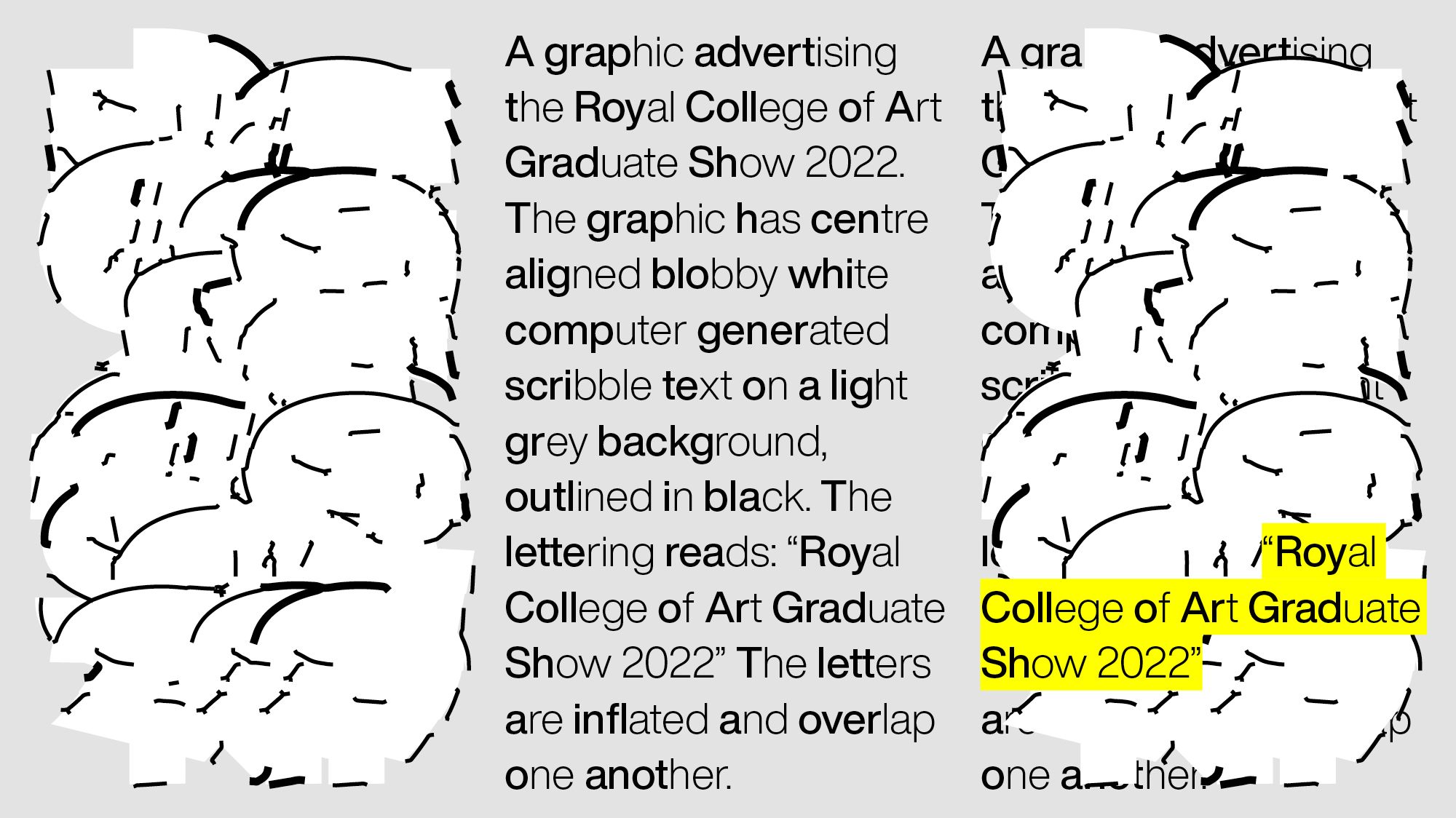
It was important for the RCA2022 identity to re-engage with this conversation; the identity becoming a moment to create conversation between students, staff and visitors about how legibility and accessibility interact. The identity stimulates this dialogue through computer generated typography and animation presented alongside image descriptions, which utilise Bionic Reading by Renato Casutt, as key moments in the design that are not only informative but also aesthetically considered.


RCA2022
The visual identity for RCA2022 is the result of collaboration between Europa and RCA students including input from the Disabled Students Network and the RCA Neurodiverse Society, as well as invaluable resources available from Shape Arts and the Royal National Institute for the Blind. Engaging in and encouraging open dialogue has been an important learning curve in demonstrating the joys of making and platforming work that everybody, regardless of ability, should be able to access, as well as the challenges and importance of pushing for better access inclusion across the board.
This is an ongoing process but through starting this conversation we push for better access provisions in the Gradate Shows and across the college and the arts more widely. This goes beyond a visual identity and encourages broad communication across college and further into the arts sector. Whilst this hasn’t been an easy process we hope that this means future years will allow the conversation about disability justice and design to continue.
RCA2022 challenges ableist modes of knowledge production, prioritises inclusion, and not only what provisions we can provide within the ID, but how we can look further towards design as an inclusive and liberatory practice.
