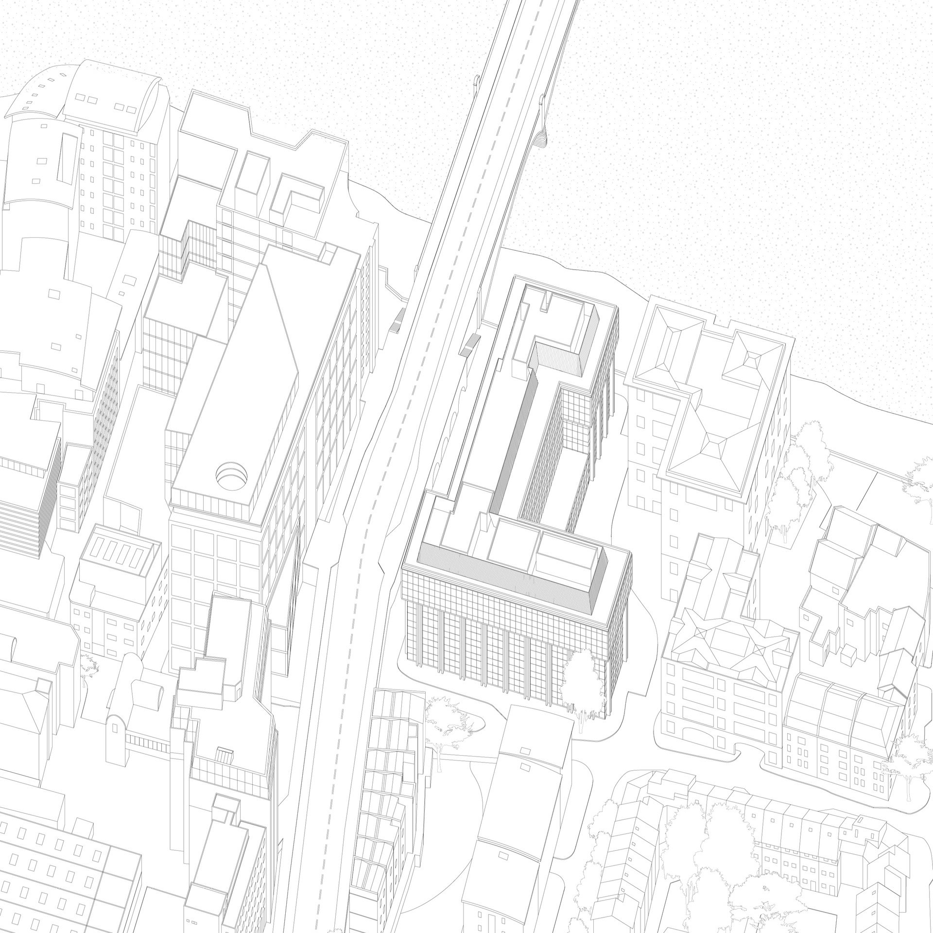
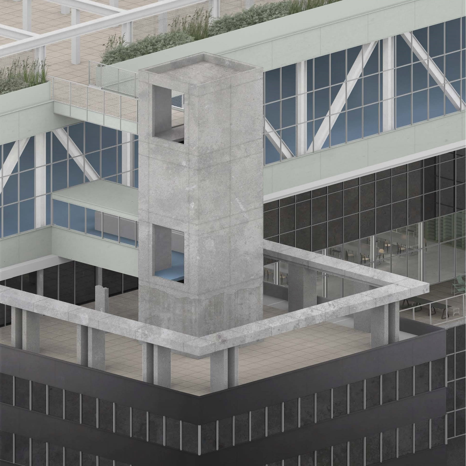
Flexibility in the previous Financial Times building implied the “Shell and Core” and “Fit Out” strategy. An intentional characterless quality aiming to allow any institution to be incorporated and unincorporated. The 1980s office block is designed as an optimised landscape, driven by economy and efficiency: 6 deep floor plates and 3 vertical concrete cores dressed by a black tinted curtain wall.
A House for the People does not culminate in a finished building with a fixed program, but a specific re-use strategy aiming at re-conditioning the building for future scenarios to occur, accepting that it can’t be reduce to programs and functions. The notion of social condenser therefore becomes a device allowing the transformation of the Financial Times building; from an exclusive palace of 1980’s capitalism, into a house for the people ready to be seized by the collective.
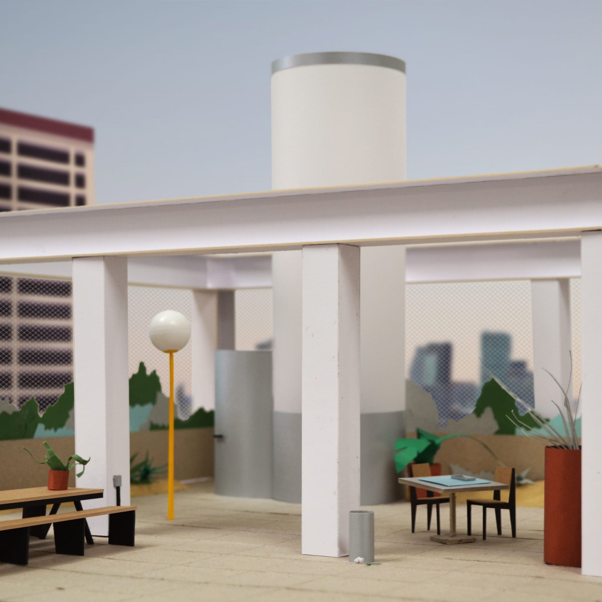
Learning from Richard Wentworth’s Making Do and Getting By, the project’s fascination with the everyday and the residue of human occupation contradicts the hyper rationalised design of the Financial Times building, and generally, 1980’s office blocks. In order to transform the existing FT building into a culturally significant monument, the project investigates an architecture driven by necessity, a composition with what is already there.
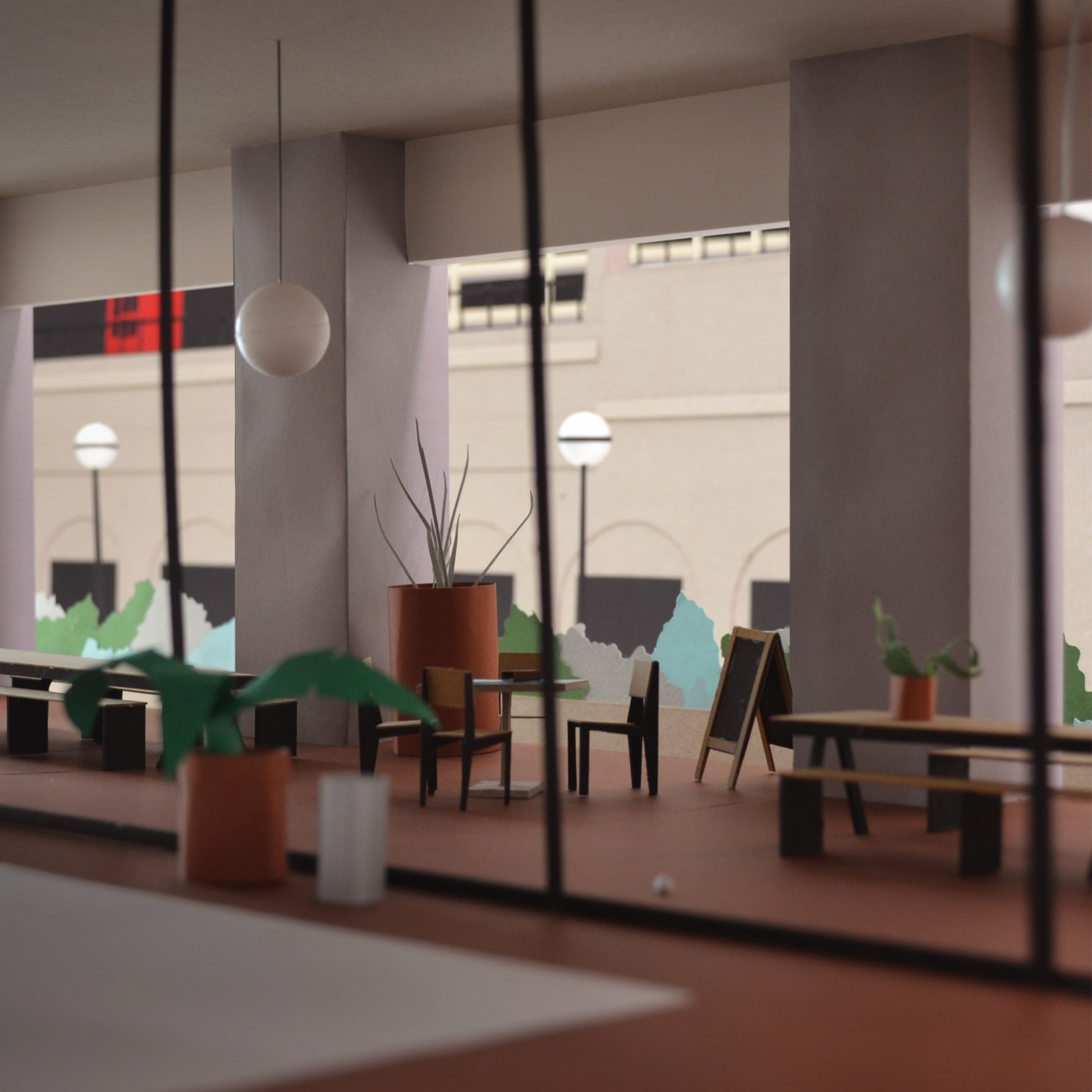
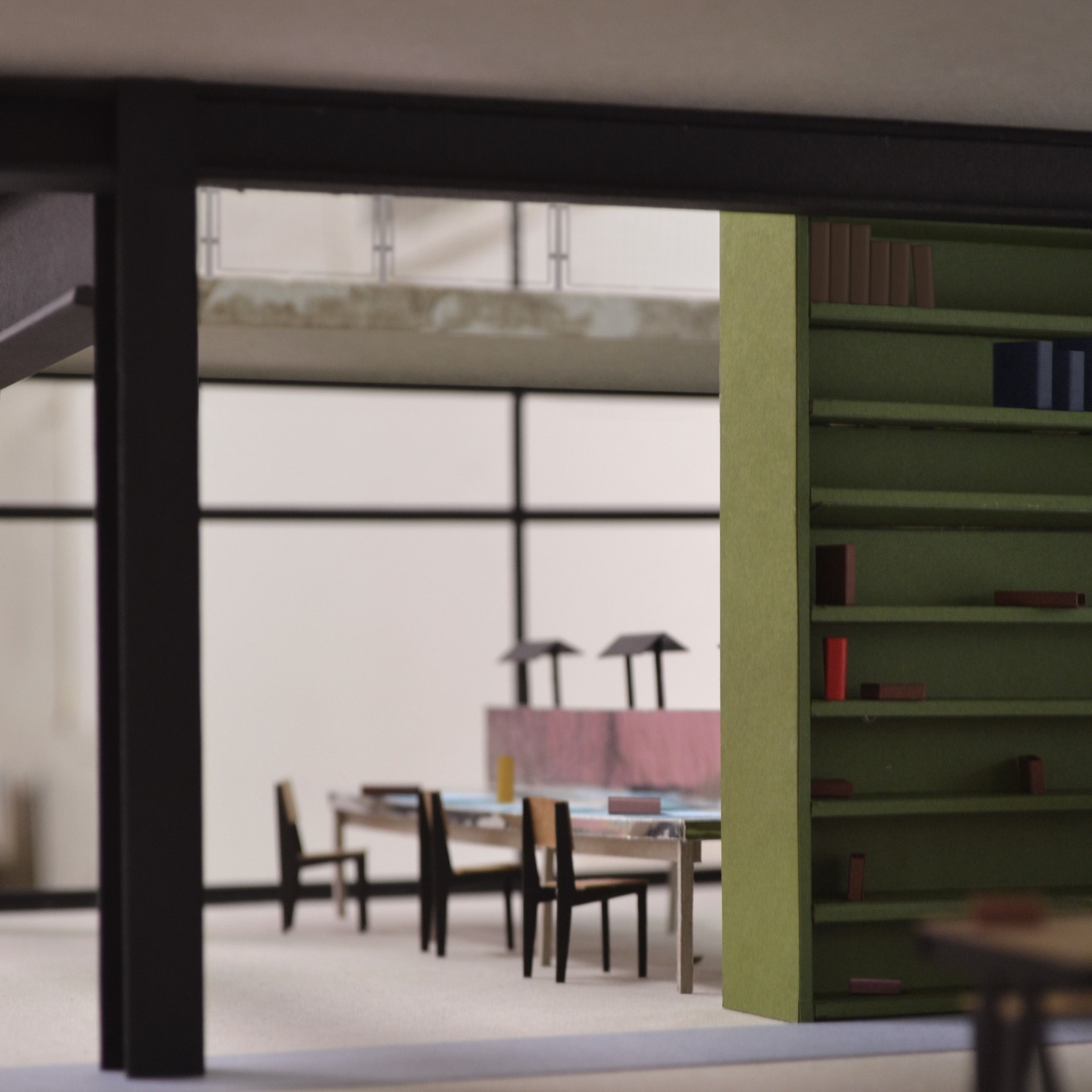
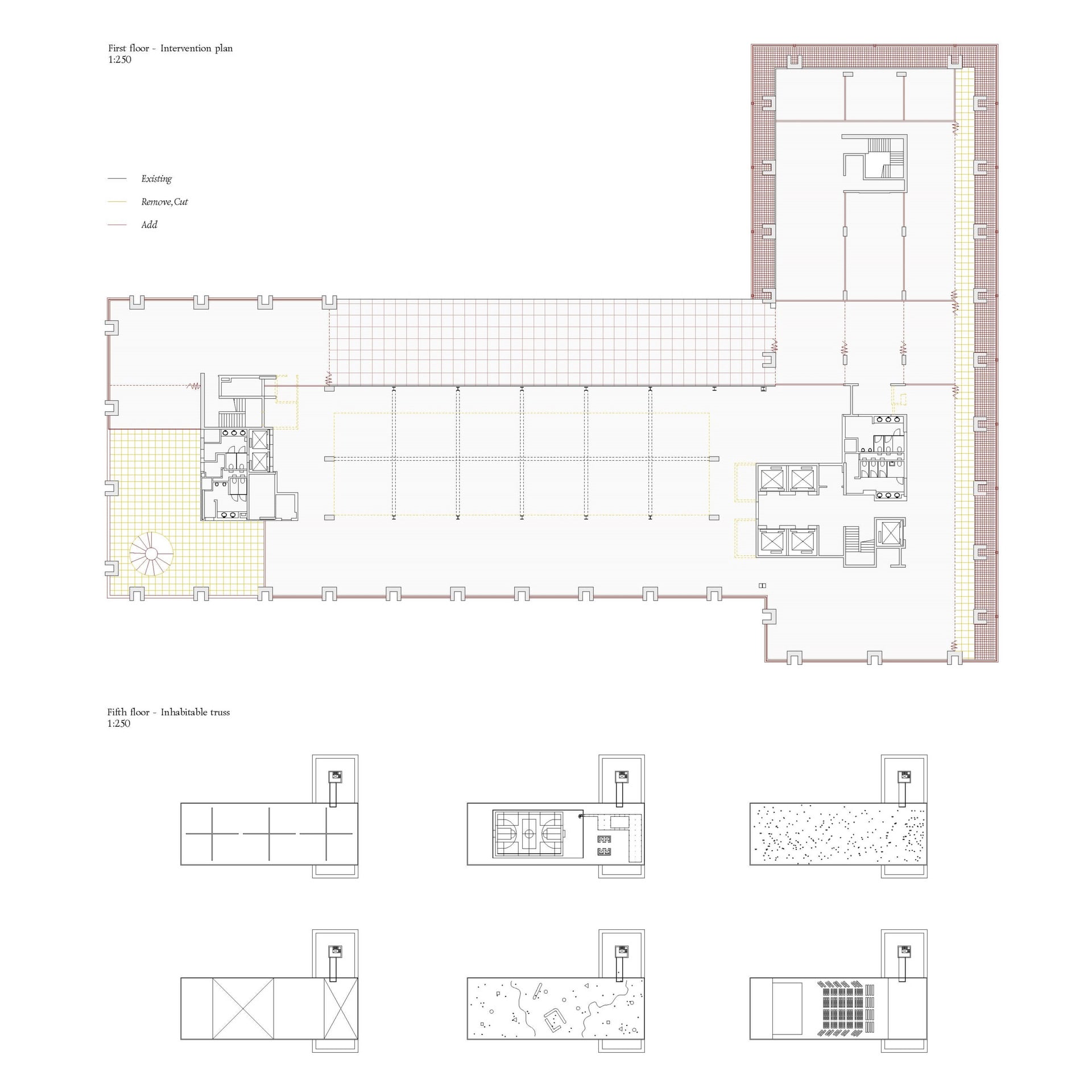
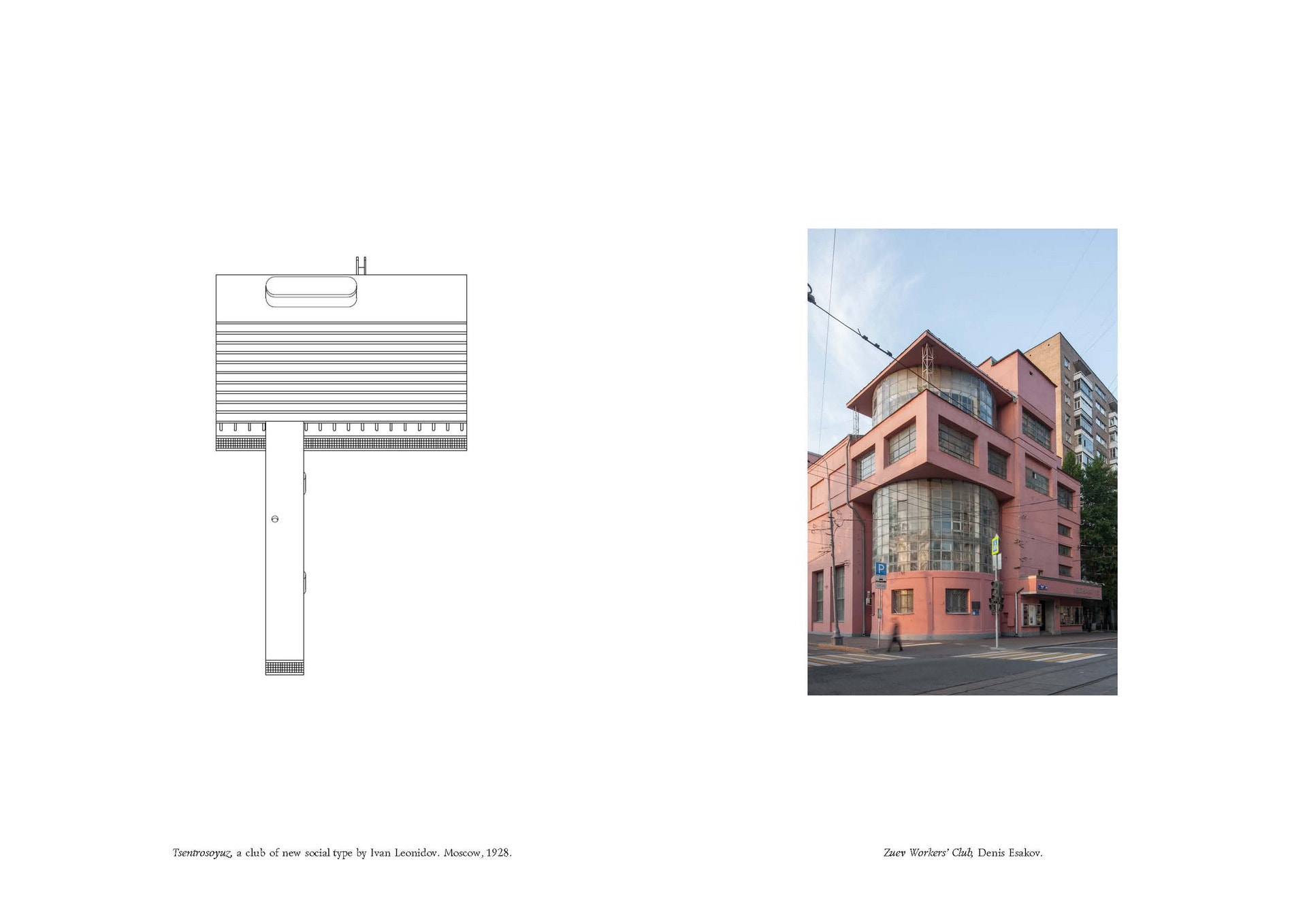
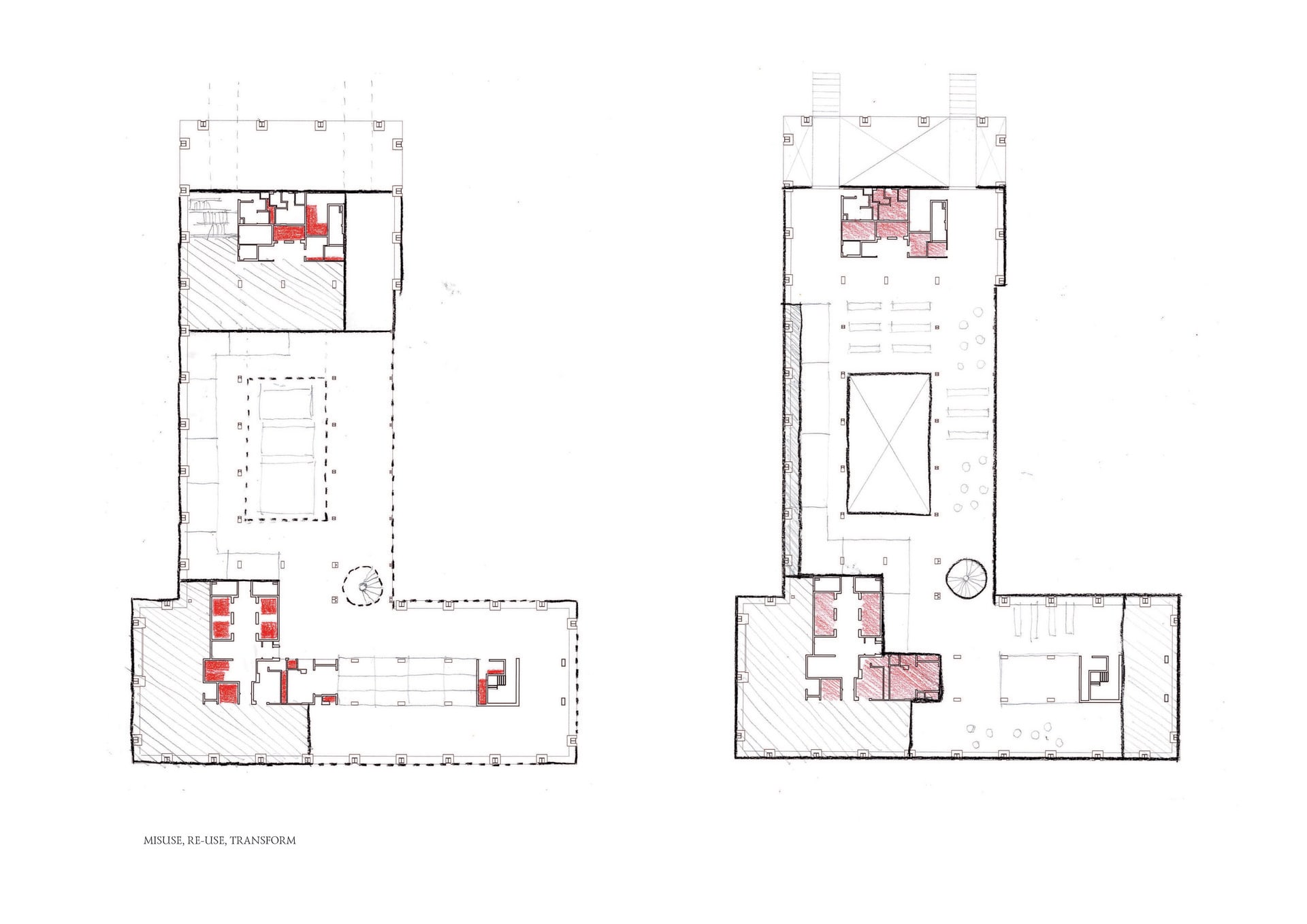
The first 4 floors, supported by the peripheral C-shaped concrete columns are lightly altered by small scale actions: opening, removing, cutting, layering, connecting. Gaining from the research on soviet social condensers, these re-purposed floors offer the potential for a variety of programmes to happen. These heterogenous programmes and spaces are stacked and connected by passages and thresholds aiming for less control and performance over the circulation.
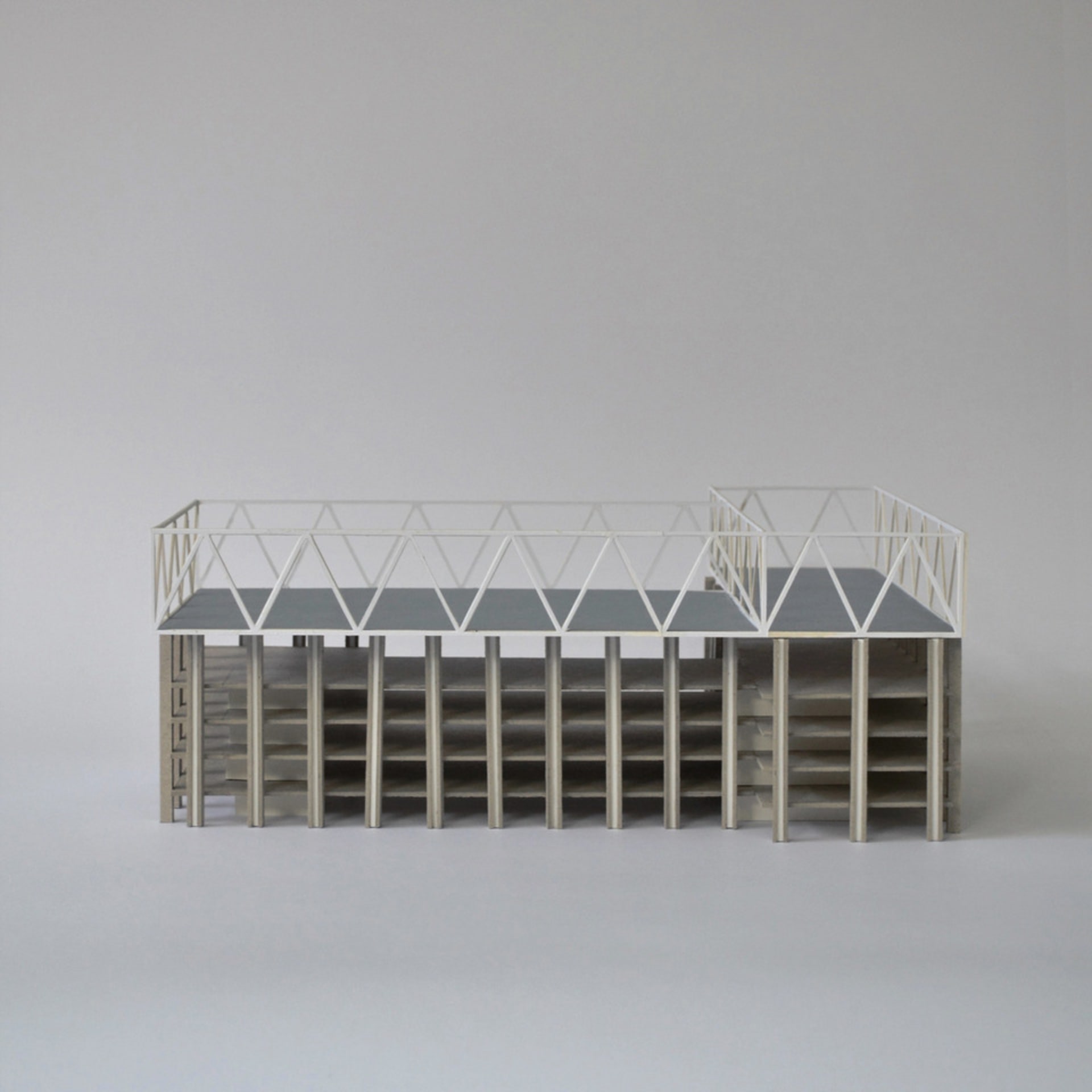
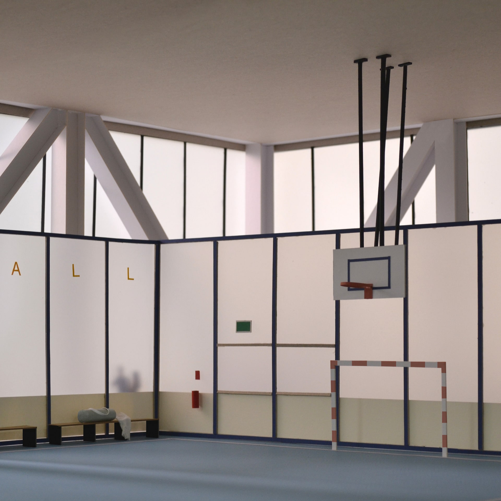
The subsequent top 2 floors, mainly using steel frame construction are removed for the addition of a Hall. This multipurpose hall provides a generous and interrupted space in the heart of the city. A basketball court? A theatre? A gallery? The hall is all of those things and none of them simultaneously.
It is designed as an inhabited truss, allowing for all loads to be transferred within the periphery, and expressed as a lightweight crown placed over the existing FT building. Unlike the bottom floor levels which preserve the mysterious figure of the previous building, the hall exaggerates the layering of new construction over the old, and reveals from distance, through the blurriness of the polycarbonate cladding, glimpses of new occupation.

