Graphic Design

Yunqi Peng

Yunqi Peng (b.1998) also works under the pseudonym of ‘CheapBall’, is a graphic designer and visual communicator. With text, typography and graphic languages as visual methods, she uses self-publishing and art book exhibitions as her main avenues of exploration.

An experimental practice in the form of art publications, the outcomes are a study of the credibility of narrative structures and non-traditional narrative models, and a concern for the delicate human issues hidden beneath the grand social narrative.

She will complete her MA in Visual Communication (Graphic Design Pathway) at Royal College of Art (London) in July 2022. Her previous education includes BA Graphic Design & Art Direction (Visual Design Pathway) from Nuova Accademia di Belle Arti (Milan, 2020), and BFA Visual Communication from East China Normal University (Shanghai, 2020).


Awards and achievements

2022

Work Selected & Interview, Design 360° (Magazine) No.98


2021

Bronze Award (Student Group), GDC Award 2021 (Graphic Design in China Award 2021)

Excellent Work, Tokyo TDC 2021 (Tokyo Type Directors Club 2021)

Most Popular Award (Student Group), 11th Hiiibrand Awards

Work Selected, Asia-Pacific Design (Annual Book) No.17

Work Selected, BranD (Magazine) No.57


Exhibitions and activities

2022

Absent Traces (Artist), London Craft Week, Bargehouse, London, UK

Pop Over and Join the Fete (Exhibitor), Espacio Gallery, London, UK


2021

abC (art book in China) Art Book Fair (Exhibitor & Lecturer), Today Art Museum, Beijing, China

Tokyo Art Book Fair (work selected), Tokyo Modern Art Museum, Tokyo, Japan 

UNFOLD Shanghai Art Book Fair (work selected), M50 Creative Park, Shanghai, China

Singularity Art Festival (Exhibitor), Modern Art Museum, Shanghai, China

Picnic Art Festival (Exhibitor), TANK Art Centre, Shanghai, China

Inky Pixel RISO Exhibition (Artist), Bananafish Bookstore, Shanghai, China

Inky Pixel RISO Exhibition (Artist), LPS Park, Guangzhou, China

Good Art Fair (Exhibitor & Lecturer), Notting Hill Art Centre, Hangzhou, China

Yunqi Peng-statement

By creating works in public space, the work connects with people and sites in meaningful ways thus breaking down the distance created by more traditional forms of display and art historical models. But unlike this, the artist’s book, as a reproducible artwork and an output of the self-publishing action, has a certain commodity and object character. It can inherently become a part of society and even of everyday life, be more accessible to a site, and better suited to telling intimate, local, small narratives than a large-scale installation.

The content of my work often originates from my observations and associations with subtle things and human emotions. By visualising textual content and literary rhetoric, as well as arranging and reorganising numerous images in a connected way make the abstract concepts readable. I want to create not just an isolated book, but a small, detachable installation, which can carry more information and intervene and occupy human activity with these messages. 

Artistic writing is also an important concern in my research, which is not limited by the traditionally-required disciplinary norms and can convey ideas while remaining artistic and reflecting the identities of the writers themselves. In such a practice, intimacy is extracted from everyday events to intervene and confront the public, creating new perspectives and landscapes of thought. Publishing in this context disrupts and deconstructs the traditional senses and content takes on a new reality and life through visual re-telling.

Rain Duplicate – (Publication inside pages), 2022
Rain Duplicate – (Publication content pages), 2022
Rain Duplicate – (Publication cover), 2022
Launch Project
Rain Duplicate – (Publication cover), 2022
Rain Duplicate – (Publication inside pages), 2022
Rain Duplicate – (Display concept), 2022
Rain Duplicate – (Publication inside pages), 2022
Rain Duplicate – (Publication introduction pages), 2022
Rain Duplicate – (Publication inside pages), 2022

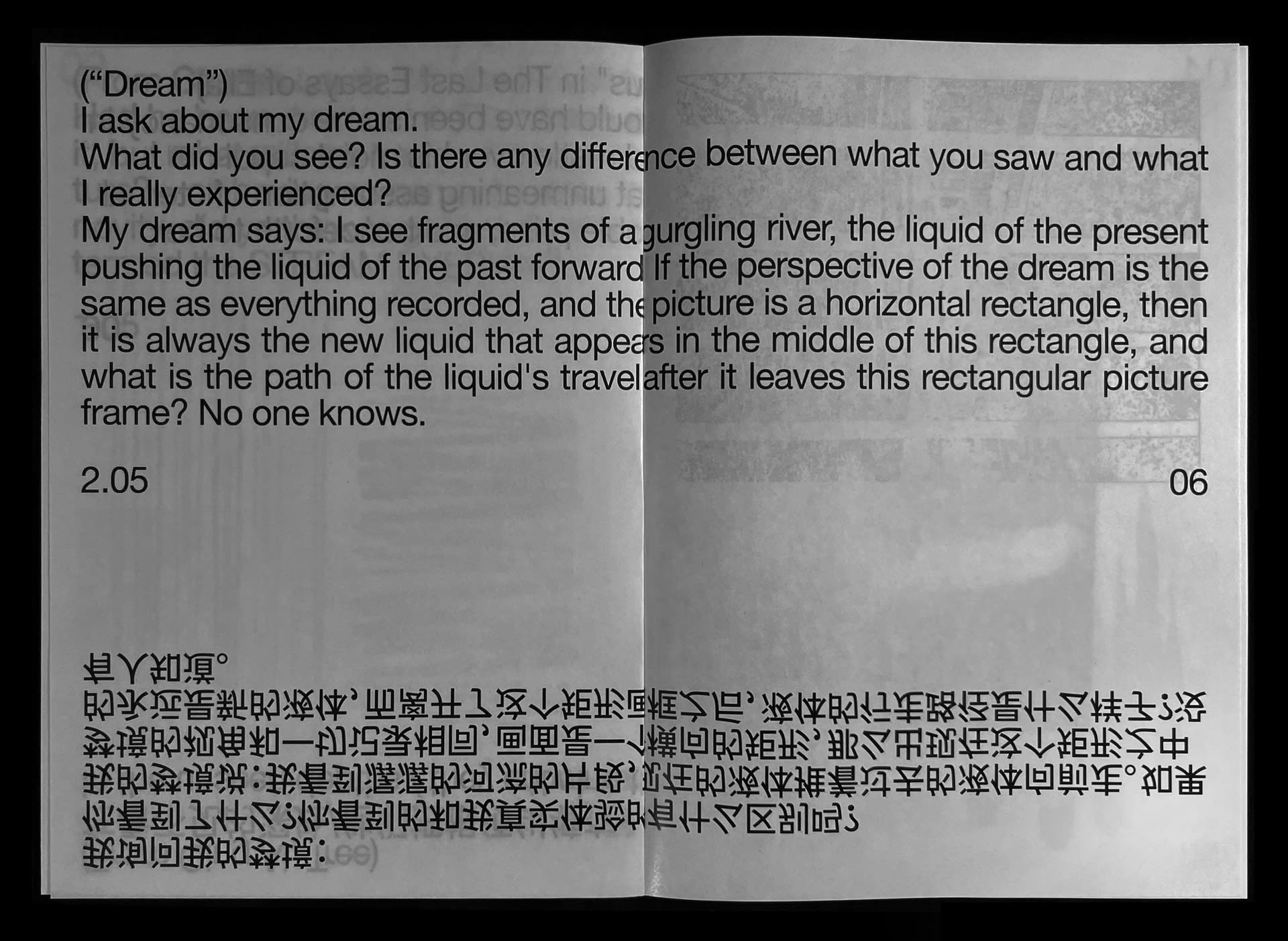
‘Leaving the river after a rain, and becoming a forgotten puddle.’

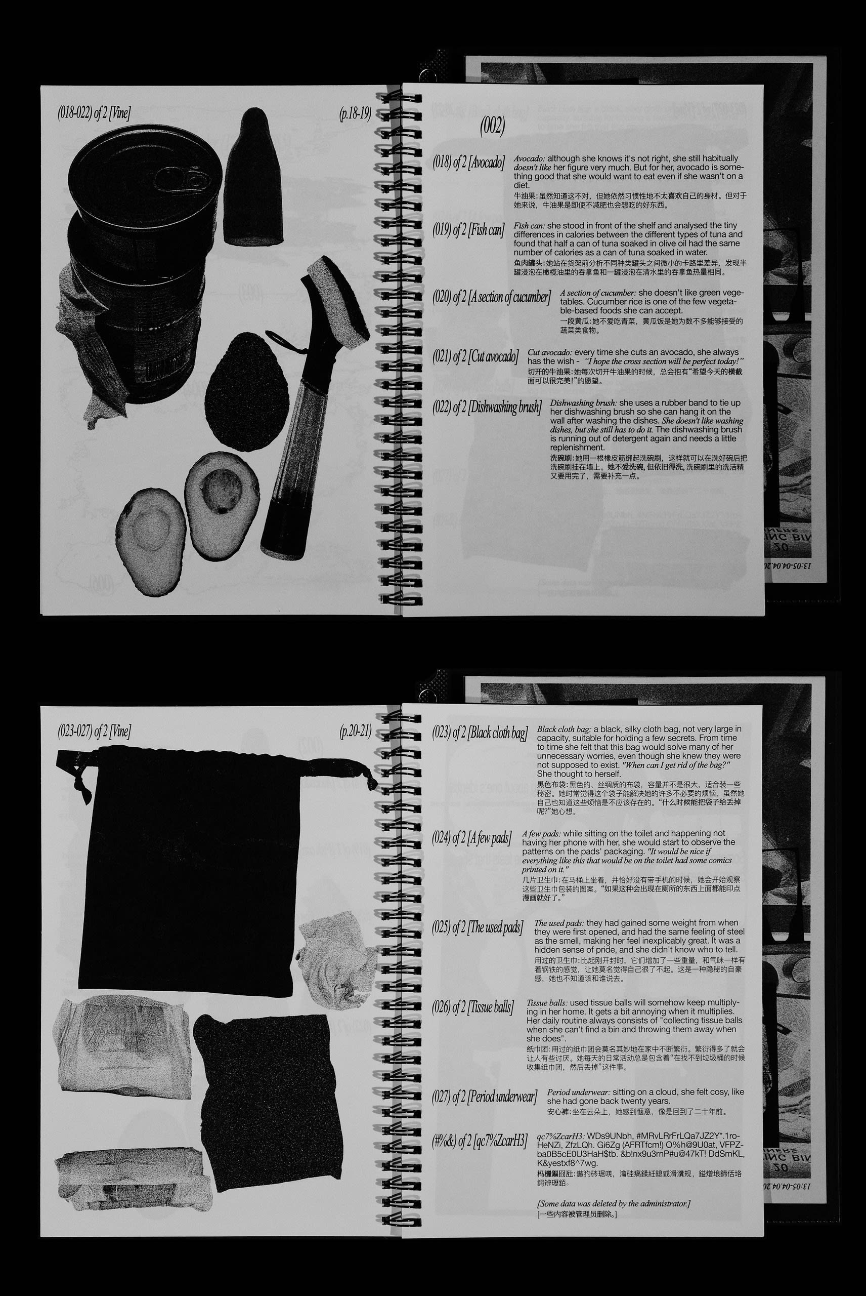
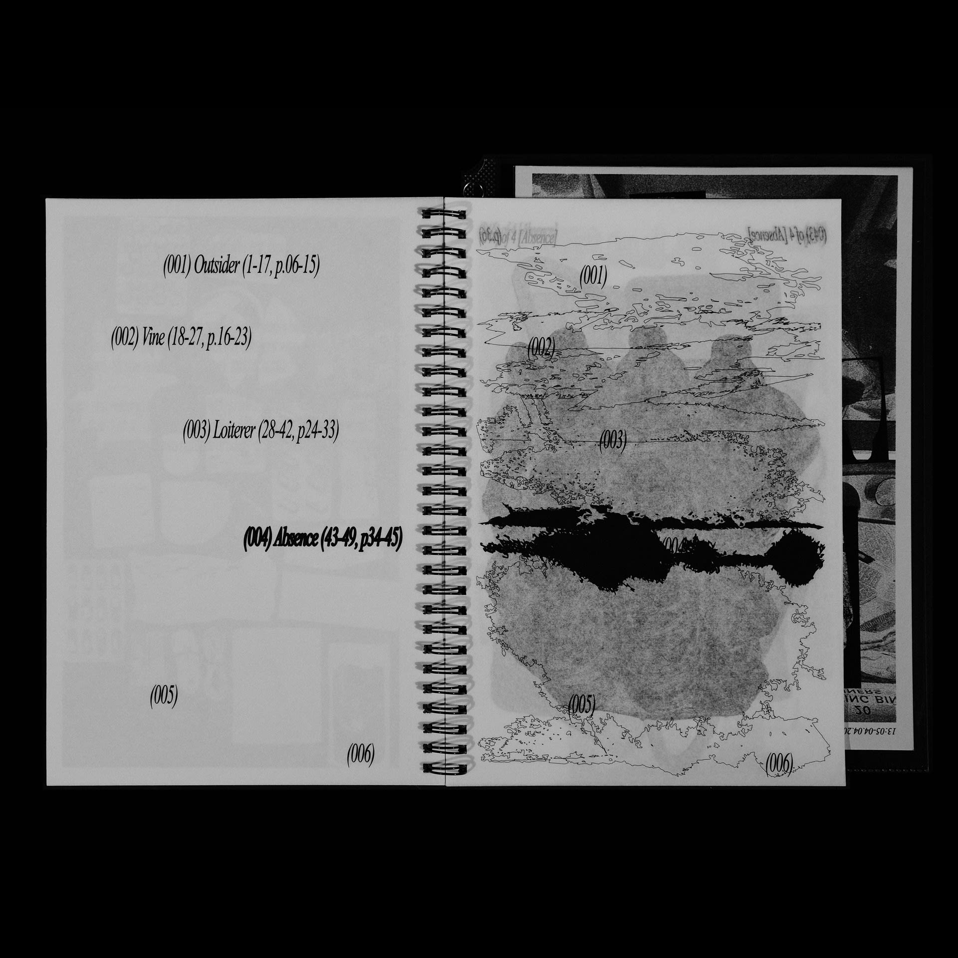
Rain Duplicate is a publication with an object catalogue as the main visual format. It was inspired by my experience of struggling to return home at the beginning of the pandemic. I try to relate to the ‘site-publishing’ methodology of my previous ‘Go to the River’ project by using the conceptual but more local and intimate site a ‘puddle’ as a visual metaphor and narrative thread, using myself as a counter-narrative object to be dissected. Objects around me are categorised by different identities in one person, becoming symbols of intimated stories, to record the private and intimate dull pains hidden behind abstract concepts and data in a fragmented way.

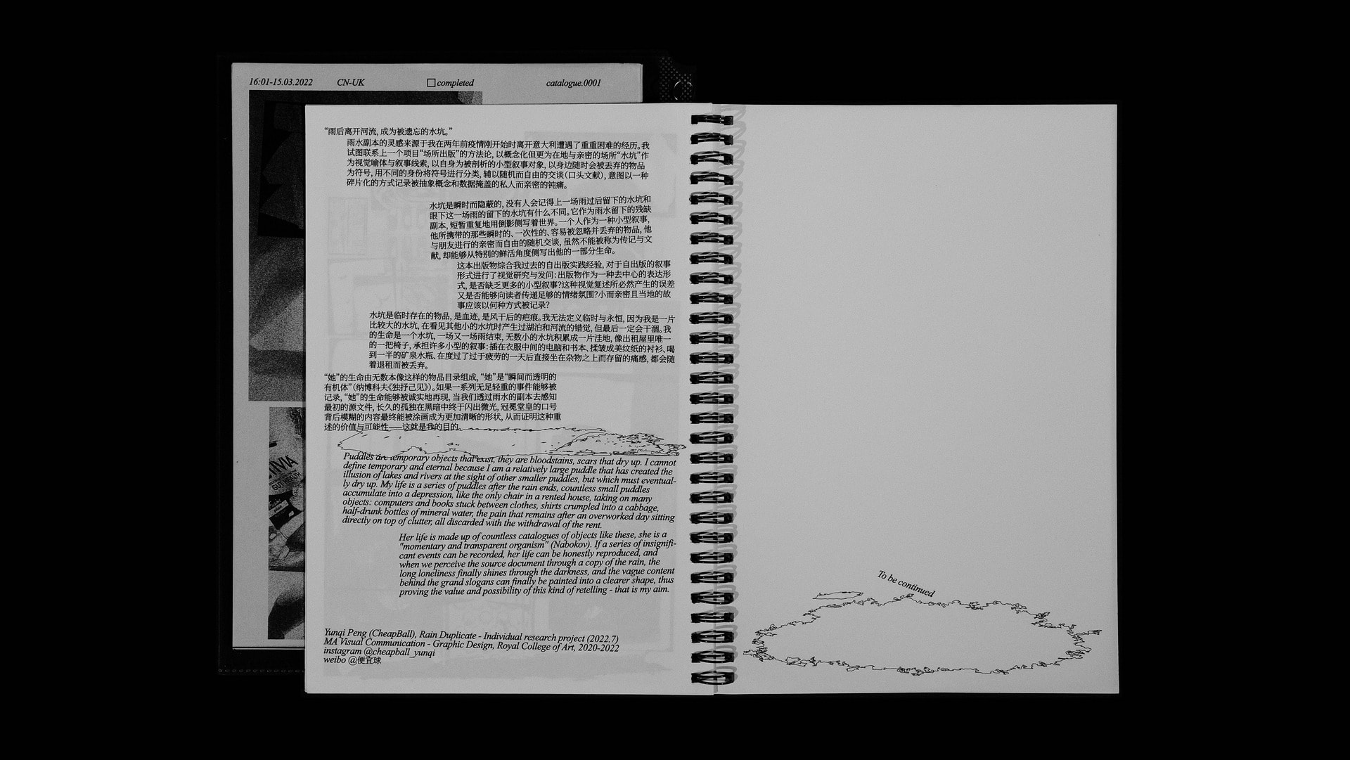
Puddles are temporary and hidden. No one will remember the difference between puddles left after the last rain and those left by the current one. They serve as several remnant duplications of what the rain left behind, briefly and repeatedly profiling the world in their mirror reflection. A person as a kind of counter-narrative, the temporary, disposable objects he carries with him, which cannot be called biographies or documents but can profile some part of his life from a particularly vivid perspective.

Puddles are bloodstains, scars that dry up. No one can define temporary and eternal because they are all relatively large puddles that have created the illusion of lakes and rivers at the sight of other smaller puddles, but which must eventually dry up. One’s life is a series of puddles after the rain ends. Countless small puddles accumulate into a depression, like the only chair in a rented house, briefly and repeatedly taking on many small narratives: computers and books stuck between clothes, shirts crumpled into a cabbage, half-drunk bottles of mineral water, the pain that remains after an overworked day sitting directly on top of clutter, all discarded with the withdrawal of the rent.

This publication synthesises my experience of self-publishing practice to visually investigate and ask questions about the narrative form of self-publishing: do self-publications nowadays need some counternarrative? In what way should small, intimate and local stories be recorded? Are the inevitable errors of such visual retellings able to convey some kind of emotional atmosphere to the reader?

In the project, I presuppose a female character based on myself. ‘Her’ life is made up of countless catalogues of objects like these, she is a ‘momentary and transparent organism’ (Nabokov). If a series of insignificant events can be recorded, her life can be honestly reproduced, and when we perceive the source document through a copy of the rain, the long loneliness finally shines through the darkness, and the vague content behind the grand slogans can finally be painted into a clearer shape, thus proving the value and possibility of this kind of retelling—This is what I hope to achieve through this project.

Medium:

Lanxuan 85gsm, tiger paper 64gsm, newsprint 120gsm, cotton 400gsm (Publication); fine warp satin 172gsm, wood (Installation)

Size:

176 × 250mm, 89 pages (Publication); variable (Installation)
Go to the River (Publication at site), 2021-2022
Go to the River – (Publication inside pages), 2021-2022
Go to the River (Publication at site), 2021-2022
Go to the River – (Publication inside pages), 2021-2022
Go to the River (Publication at site), 2021-2022
Launch Project
Go to the River (Publication at site), 2021-2022

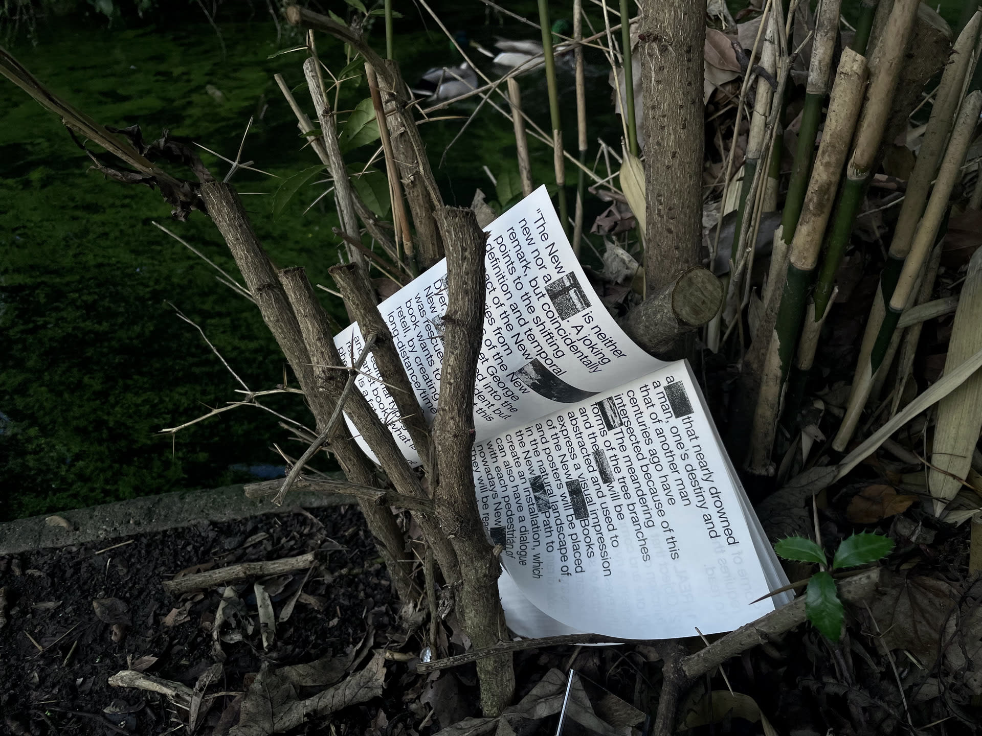
Go to the River is an independent publishing project based on an old river in London: the New River.

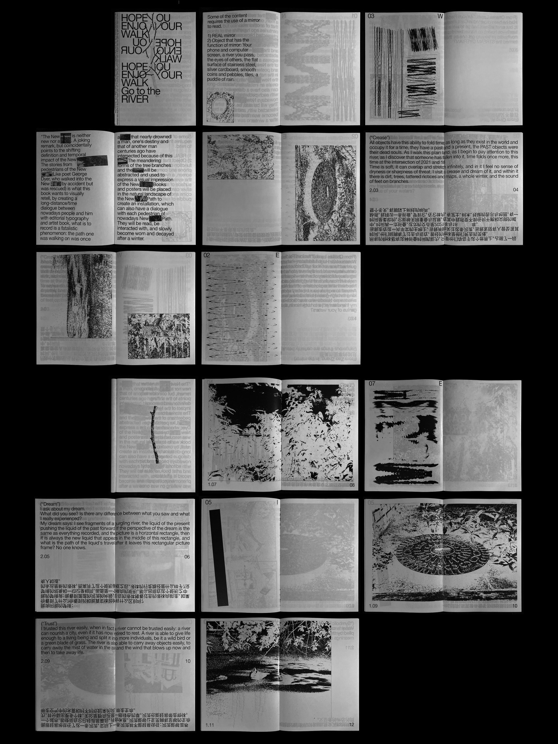
‘The New River is neither new nor a river.’ A joking remark, but coincidentally points to the shifting definition and temporal impact of the New River. The stories of pedestrians along the New River (like poet George Dyer, who walked into the New River by accident but was rescued) are what this publication wants to visually retell. By creating a long-distance/time dialogue between people (from different times and spaces) and Dyer with editorial typography, what this book would like to record is a fatalistic phenomenon: the path one was walking on was once a river that nearly drowned a man, destinies have intersected because of this river.

The meandering forms of the tree branches and the river will be abstracted and used to express a visual impression of the New River. Documents and poems relating to Dyer are excerpted in the book, in dialogue with poets from other countries and eras, as well as the designer’s monologues walking the New River Walk. Some of the text in the book is inverted, and the reader may need the assistance of a mirror to complete the reading. Whether the mirror represents a real mirror or a clear river, there is another world in the mirror that records the present and can also refer to the past.

For the choice of material, light white kraft paper was used, which is smooth on one side and relatively rough on the other, to create a subtle sense of dialogue inherent in the material. This kind of paper has high tear strength, bursting power, and dynamic strength and is somewhat water-resistant, not breaking up in the water and causing environmental pollution. It is semi-transparent, and the drawings on the next page can peer through the text on this page in a blurred shape, creating a stronger connection between each page.

Books are placed in the natural landscape of the New River Path to create an installation, which can also have a dialogue with each pedestrian of nowadays New River Path. They will be read, interacted with, and slowly become worn and decayed after a winter. The publication itself is only part of the project. Over a long period, the environment and the traces left on it by those who read it will complete the project. This formal concept of the publication consisting of itself and the space in which it is located is also worthy of long-term consideration.

Medium:

Light white kraft paper 85gsm

Size:

148 × 210 mm, 112 pages
Cyber Isolation, 2021

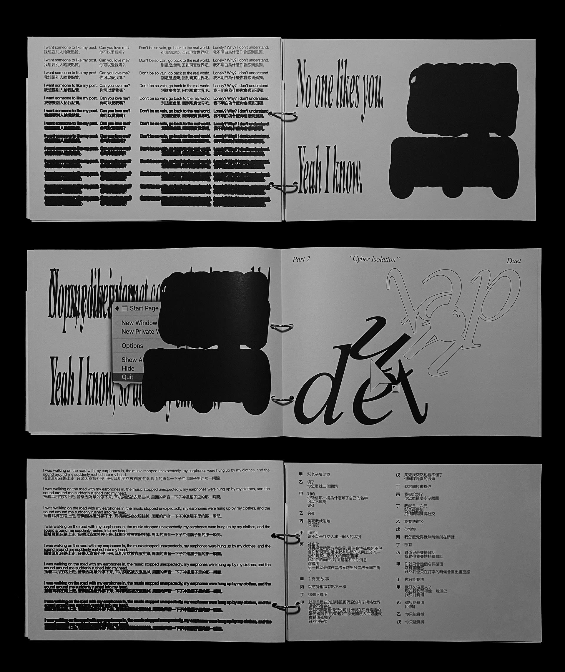
As my previous practice of publication making, Cyber Isolation is a visual representation and narrative study of a sense of loneliness that is specific to this era.

Cyber Isolation: a sense of isolation specific to virtual space – because of the instability of virtual communication. The back-and-forth conversations of real life are replaced by the dilemma of ‘being ignored by an unknown number of people passing by’, a subtle feeling that often arises while waiting on the screen for the time lag caused by the speed of the internet intersecting with countless other spaces. And as a particular era creeps into the world and begins to spread, individual feelings cascade and eventually become a collective memory.

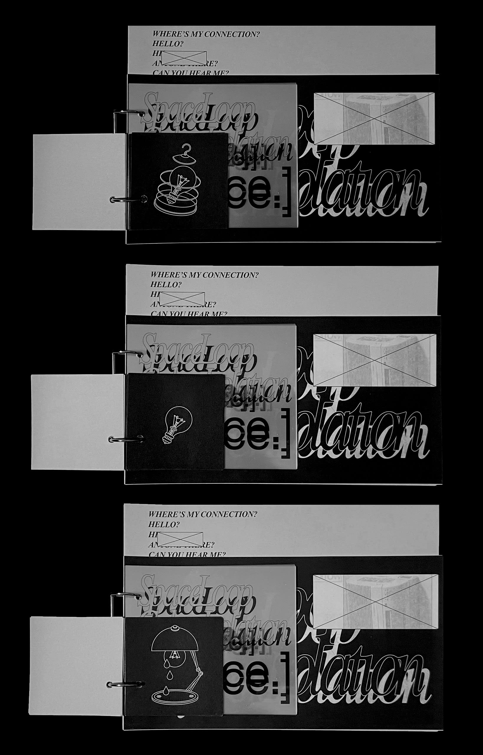
The book is made up of four sections, bound in a circular loose-leaf format, to allude to a state of infinite overlap and continuity.


The 1st section: printed on one side on square newsprint, the abstract line illustrations resemble static frames extracted from an animation, depicting the story of an imprisoned light bulb who thinks he is free but is overwhelmed by isolation, alluding to the double-sided nature of the virtual world.

The 2nd section: the keyword ‘Cyber Isolation’ is printed on transparent PET material, the transparency of the material allows for a richer overlay effect when flipping through it, a black shadow of numerous stories referred to by numerous keywords, making it impossible to distinguish the content of each individual.

The 3rd section: printed on indelible translucent tiger paper, a visual representation of each of the keywords in the second section, with numerous fragmentary images and text boxes popping up on the paper, interacting and permeating each other due to their material.

The 4th section: composed of text and text-based visual content, profiling or writing directly about the loneliness of the cyber world, has a somewhat coherent narrative structure compared to the fragmented structure of the first three parts - even if the narrator remains less than objective.

This is a project-based, independent self-published publication in which I attempt to move the concept into the portable and disseminative realm of publication, using paper as a medium and exploiting the subtle differences between different papers metaphorically.

Medium:

Tiger paper 64gsm, newsprint 120gsm, PET 120gsm

Size:

210 × 297 mm, 146 pages
Peppers Summer, 2021

Experimental exploration of printing methods is also a part of my practice.

‘Only when you move do you realise that things that are normally insignificant can take up so much space, just like when you only find a sweet pepper missing from the kitchen table when you’re stir-frying meat.’ Peppers Summer is a portrait of things that are often overlooked but precious in daily life. The text arrangement composed of seemingly absurd words and abstract graphics are combined, which is full of symbolic effects. At the same time, it also formed a ‘pop-like’ visual effect like street advertising. This series of neglected things is actually a series of metaphors of people and things in real life, trying to make people think about the possibility and richness of things that exist on the dark side in a less heavy and somewhat contemporary Chinese way. The selection of rough-textured newsprint and fluorescent monochrome stencil printing (Risograph) inks makes this series of portraits have ‘rough and precious’ characteristic from the design itself to the actual carrier.

Medium:

Risograph ink (black, orange, green, fluorescent orange), newsprint 120gsm

Size:

297 × 420 mm
Abyss Staring, 2020-2021

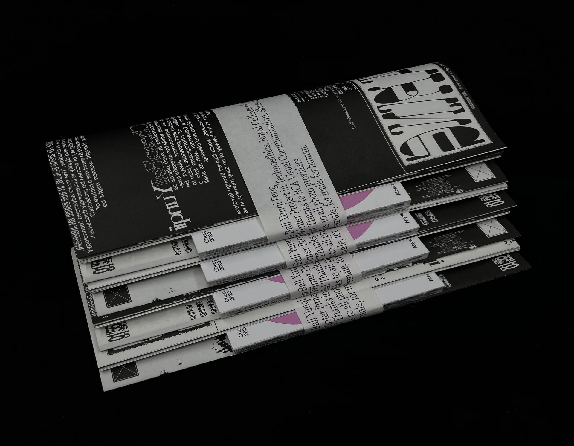
Abyss Staring was the first project I completed at the Royal College of Art and was an opportunity for me to start thinking about ‘what identity to use to communicate as a creator’.

Female is placed under the gaze of an entire society of erotic culture, in this social environment, the female body is visible and obvious, while the male body is in shadow; The more advanced technology develops, it seems that the safety of women’s bodies and dignity is increasingly threatened. Females find themselves having the possibility to be subjects of erotic material, while the stressful insecurity always is denounced as narcissism and paranoia by the public opinion. In the age of technology, how should the body and dignity of women be protected?

People were asked to send me a picture of a place where they thought women might be gazed at. The collection of these photographs was compiled into a book and was put next to a typewriter with its shell removed, sharp and clawing. The typewriter kept spitting out words hidden in the pictures, words flashed through one’s mind in the dead of night, in the quiet of an afternoon, in the hallway of early morning, in a second when they suddenly broke into a cold sweat.


‘There you are.’

‘I found you.’


The project consists of a movable publication and a non-movable typewriter, where the audience begins to have the choice of being a spectator of the ‘artwork’ or a reader of the ‘book’, and where the exploration of visual communication of social narratives begins to emerge.

Medium:

Art silk paper 120/150gsm, munken paper 85gsm, fluorescent pink pvc sheet (Publication); typewriter (Installation)

Size:

105 × 297 mm, 104 pages (Publication); variable (Installation)