Communication Research (PhD)

Karin von Ompteda

Hello! I am an Assistant Professor of Graphic Design at OCAD University in Toronto, Canada. My work is driven by inclusivity, challenging disciplinary boundaries, and design as an agent for positive social change. I approach my work with the perspective of a person with a disability, and a background in science (MSc Biology) and design (BDes Graphic Design).

My PhD research is focused on typeface legibility for adults with low vision. This interdisciplinary research makes a significant contribution to a field still lacking in evidence-based accessible design guidelines. Please see “Statement” for more information.

Alongside my PhD research, I have developed a design practice termed data manifestation, through a hybrid teaching and research practice at RCA and then at OCAD U. Data manifestation helps people to understand complex statistics by communicating them in simple and visceral ways through objects, installations, and sensory experiences. Implicit in this work is making data accessible to people who may lack skills in numeracy or statistical literacy. My publications have focused on creating meaningful connections with data in the areas of COVID-19, climate change, and various social issues. See my website for further information.

Please feel free to get in touch


PUBLICATIONS

Von Ompteda, K. (forthcoming) ‘Data Manifestation: Climate Change Data in the Home and on the Body’, in: L. Atzmon (ed), Design & Science, London: Bloomsbury Press.

Von Ompteda, K. (2022) ‘Data and Emotion: The Climate Change Object’, in: I. Gwilt (ed), Making Data: The Creative Practice of Materialising Digital Information, London: Bloomsbury Press.

Von Ompteda, K. (2021) ‘Creating Meaningful Connections Through COVID-19 Data Manifestation’, IEEE VIS 2021 Arts Program (VISAP ’21), 24-29 October, Virtual.

Von Ompteda, K. (2019) ‘Data Manifestation: A Case Study’, in: T. Triggs and L. Atzmon (eds), The Graphic Design Reader, London: Bloomsbury Press.

Von Ompteda, K. (2019) ‘Data Manifestation: Merging the Human World and Global Climate Change’, IEEE VIS 2019 Arts Program (VISAP ’19), 21-25 October, Vancouver, Canada.

Von Ompteda, K. and Walker, K. (2015) ‘Translating the Quantum World to Human Scale: An Art-Science Collaboration’, IEEE Computer Graphics and Applications, 35(3), 74-81.

Walker, K. and von Ompteda, K. (2014) ‘PhysicSpace: From Quantum to Human Scale’, IEEE VIS 2014 Arts Program (VISAP ’14), 9-14 November, Paris, France.

Von Ompteda, K. (2011) ‘Typo Transparencies’, Grafik Magazine, G192. pp.83-97.

Von Ompteda, K. (2009) ‘Innovation in Inclusive Typography: A Role for Design Research’, in: Proceedings of Include 2009: International Conference on Inclusive Design, 5-8 April, London: Helen Hamlyn Centre.


INVITED PRESENTATIONS (Selection)

Eastern Michigan University, Ypsilanti, United States (2019)

Dagstuhl Seminar on Data Physicalization, Wadern, Germany (2018)

Leonardo Art Science Evening Rendezvous (Lasers), Toronto, Canada (2017)

Code Creators Summit, Digital Catapult Centre, London, UK (2016)

BBC World Service, The Forum, London, UK (2014)

Arts Council England, Manchester, UK (2014)

Information Design Association, London, UK (2013)

Interaction x Information Innovation Forum, Beijing, China (2013)

Information in Style Symposium, CAFA Art Museum, Beijing, China (2013)

TYPO London, London, UK (2011)

Central Saint Martins, London, UK (2009)


DATA MANIFESTATION WORKSHOPS (Selection)

Arts Council England, Manchester, UK

Royal College of Art, London, UK

University for the Creative Arts, Epsom, UK

OCAD University, Toronto, Canada

China Central Academy of Fine Arts (CAFA), Beijing, China


Degree Details

School of CommunicationCommunication Research (PhD)
Typeface 'o's plotted according to stroke width and letter width values

My PhD is entitled The Influence of Stroke Width on Legibility for Low Vision Adults: Integrating Scientific & Design Knowledge on Typeface Boldness

The driving force behind this research is my disability and experiences with motor and sensory impairment because of my multiple sclerosis. Most relevant to this work are my experiences with visual impairment and the barriers to participation in society caused by inaccessible text. My research responds to the paucity of evidence-based inclusive typography guidelines, and the lack of interdisciplinary legibility research which has contributed to this gap in knowledge. I have been able to undertake this research—integrating vision science and typographic design knowledge—based on my background in biology (BSc; MSc) and graphic design (BDes).

This interdisciplinary PhD research is formulated around one main question: What is the optimal typeface stroke width for low vision adults? While scientific evidence suggests that an increased stroke width—or bolder typeface—can improve legibility, optimal values are not well understood. In keeping with this, existing accessible design guidelines recommend a large range of typeface weights from regular to bold. The goal of this PhD research is to inform print design guidelines with a higher degree of specificity, and thereby increase the proportion of the population able to access text.

The core method of my practice-based research is information visualization. I developed a quantitative approach to typeface analysis, involving the measurement of typeface proportions and visualizing this typeface data. My original contribution to knowledge includes visualizing how the stroke widths of typefaces experimentally found to improve legibility (scientific knowledge) relate to the stroke widths of typefaces commonly employed in design practice (design knowledge). My analysis indicates that sans serif ‘regular’ weight typefaces commonly used for setting text are not optimal for low vision reading.

Please see the PDF below which includes the Abstract, Front Matter, and Chapter 1: Introduction. The entire PhD thesis will become available for download from the RCA Research Repository; in the meantime, please feel free to email me.

Five different letters illustrating how typeface proportions are measured
FIGURE 1: Typeface anatomy and letters employed for measurements, illustrated using the typeface Bodoni.
Four fonts of different boldness
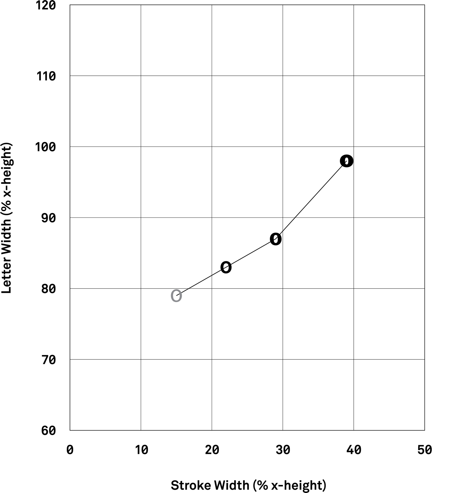
Graph showing the stroke width and letter width of four typefaces
FIGURE 2: The analysis of different weights of Franklin Gothic. Four typefaces are measured, and their stroke width and letter width values are visualized. The letter 'o' from each typeface is plotted, visually illustrating the proportions associated with parameter values. The three heavier weights (black) are found to be more legible than the lightest weight (grey), based on the legibility study by Sheedy et al. (2005).
Graph showing the stroke width and letter width of typefaces
FIGURE 3: The upper right quadrant contains typefaces found to have higher legibility (black ‘o’s), based on legibility studies included in the analysis.

Visualizing Scientific Knowledge

My PhD research consolidates scientific knowledge on the influence of boldness on legibility in the context of low vision. I analyze ten scientific legibility studies that test the influence of boldness on legibility, dating from 1912 to 2019. This entails measuring and visualizing the stroke width and letter width values of the typefaces used as experimental test material and found to have higher and lower legibility. My analysis elucidates the relationship between typeface proportions and reading performance.

Graph showing the stroke width and letter width of sans serif typefaces
FIGURE 4: Sans serif roman, extended, and condensed typefaces plotted according to stroke width and letter width.
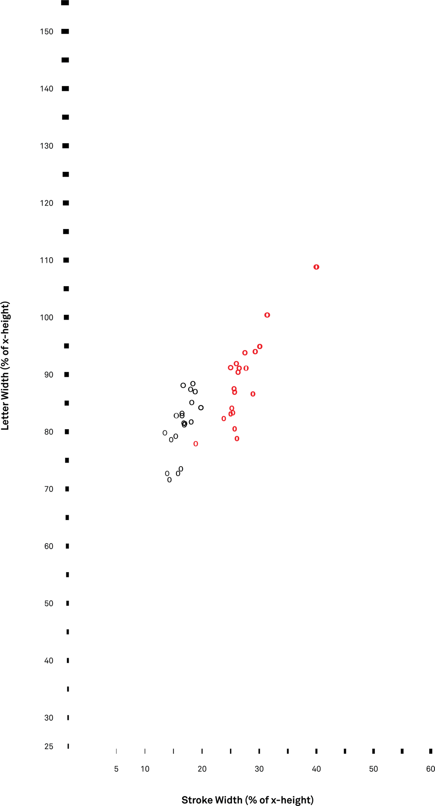
Graph showing the stroke width and letter width of regular and bold weight typefaces, colour-coded
FIGURE 5: Typefaces colour-coded to represent regular (black) and bold (red) typefaces.
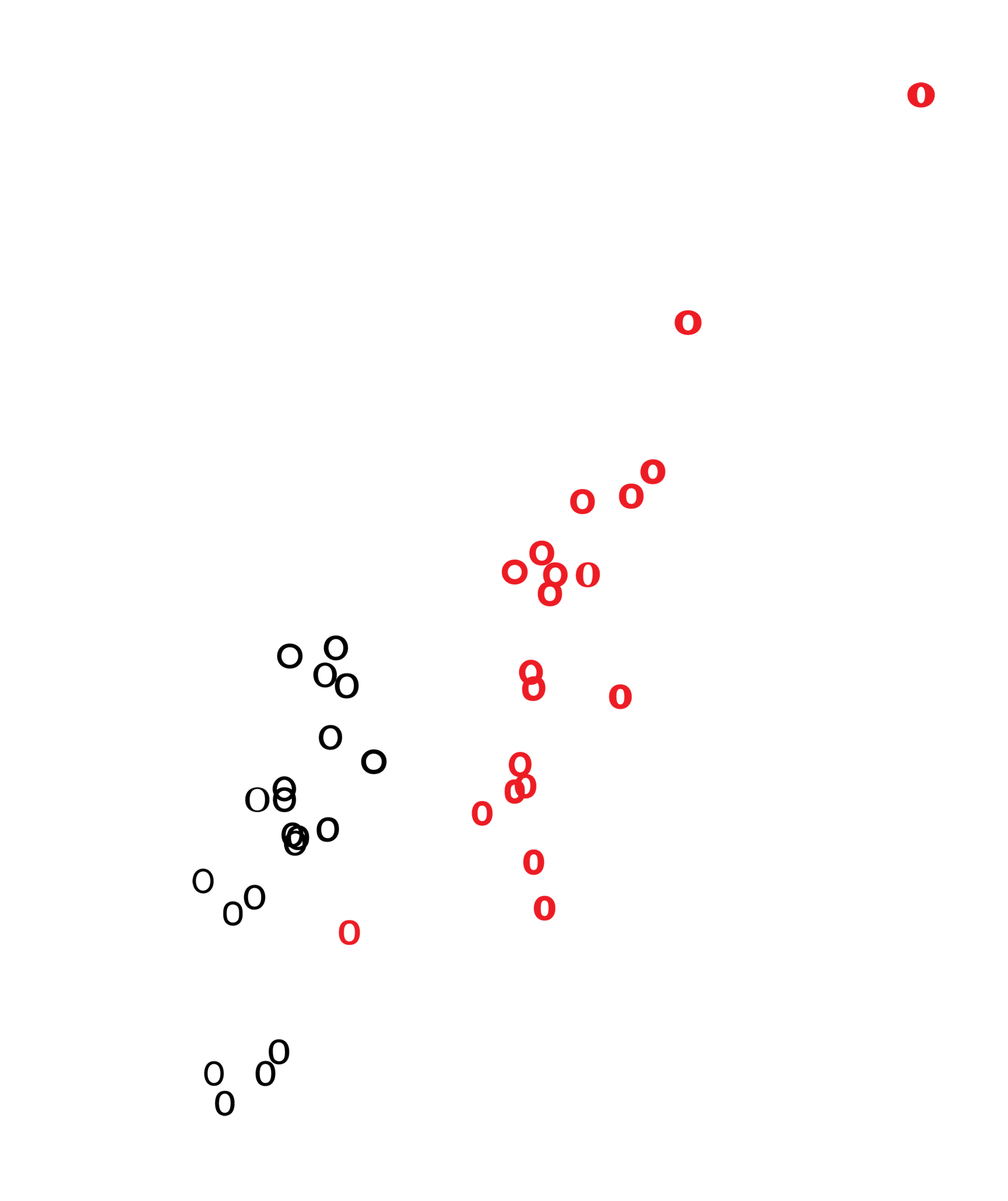
Graph showing the stroke width and letter width of regular and bold weight typefaces, colour-coded
FIGURE 6: Detail of Figure 5.

Visualizing Design Knowledge

Design knowledge is formalized by measuring and visualizing the stroke width values of typefaces commonly used in design practice. This is a design phenomenology study as defined by Nigel Cross, investigating design knowledge residing in artefacts themselves. A points-based survey of design sources (e.g. typeface bestsellers lists) is employed to determine a group of typefaces to serve as the basis for investigation. The stroke width and letter width of twenty sans serif text typefaces are measured and visualized, and the relationship between typeface nomenclature (e.g. “bold”) and numerical values is determined.

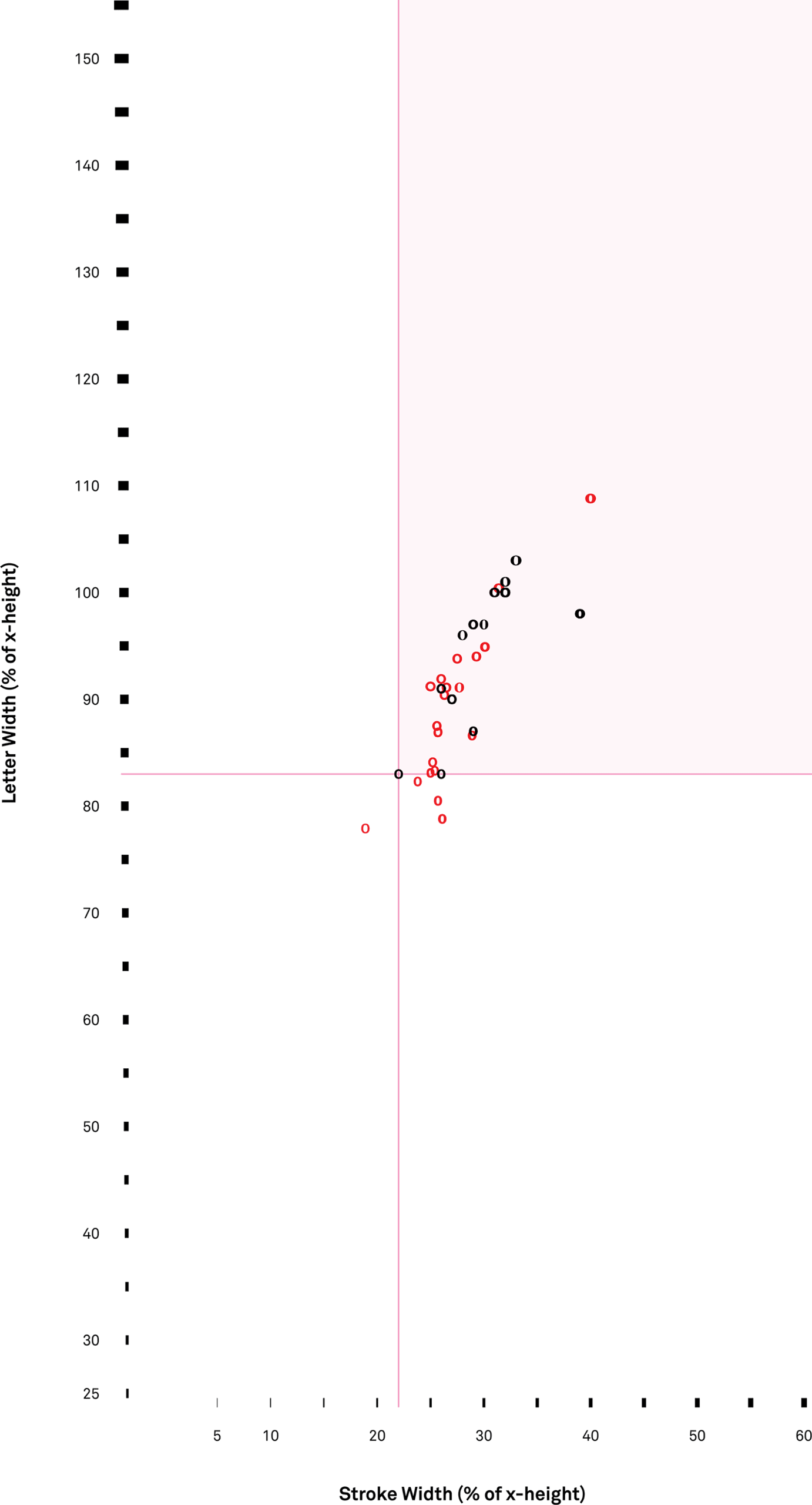
Graph showing stroke width and letter width of fonts, with the upper right area shaded pink to represent higher legibility
FIGURE 7: Relationship between typefaces experimentally found to be more legible (upper right quadrant, pink area) and regular weight typefaces.
Graph showing stroke width and letter width of fonts, with the upper right area shaded pink to represent higher legibility
FIGURE 8: Detail of Figure 7.
Graph showing stroke width and letter width of fonts, with the upper right area shaded pink to represent higher legibility
FIGURE 9: Relationship between typefaces experimentally found to be more legible (black) and bold typefaces (red).
Graph showing stroke width and letter width of fonts, with the upper right area shaded pink to represent higher legibility
FIGURE 10: Detail of Figure 9.

Visualizing Interdisciplinary Knowledge

By integrating scientific and design knowledge, interdisciplinary knowledge on typeface legibility for low vision adults is developed. My original contribution to knowledge includes visualizing how the stroke widths of typefaces experimentally found to improve legibility (scientific knowledge) relate to the stroke widths of typefaces commonly employed in design practice (design knowledge).

Visualizations of interdisciplinary knowledge evidence that sans serif regular weight typefaces commonly used in design practice have lower stroke width values than typefaces found experimentally to improve reading performance in the context of low vision. In contrast, many sans serif bold typefaces have proportions similar to typefaces found to improve reading performance.

My analysis indicates that sans serif regular typefaces are not optimal for low vision reading. The analysis further indicates that many, but not all, sans serif bold typefaces may improve reading performance for adults with low vision. This research is intended to be useful for legibility researchers and the development of evidence-based accessible design guidelines.

This PDF includes the first 39 pages of my PhD Thesis (Abstract, Front Matter, Chapter 1: Introduction). The entire PhD thesis will become available for download from the RCA Research Repository; in the meantime, please feel free to email me.

Commonwealth Scholarship, United Kingdom; Doctoral Fellowship, SSHRC (Social Sciences and Humanities Research Council of Canada); Canadian Centennial Scholarship; PhD Student Award, Royal College of Art