Illustration

Rafael Zugliani

I like archives, and I like historical things – and as a graphic designer, my passion is consolidated by using archival material to re-spark interest in overlooked aspects of our society, and broaden our perspectives when discussing social matters.

For me, research is inseparable form practice. So whichever approach I take for a project, my process will inevitably guide my choices for the media, tools and visual I employ.

I am a London based designer graduated from Central St Martins with a BA in Graphic Communication Design. Originally from Brazil, I have studied in Japan and now in the UK, which further informed my understanding of communication based on different cultural contexts.

Co-designer for Fugitive Voices lecture series started by Eleni Ikoniadou, with Andrea Sisó , Anya Landholt, Junyi Yan, Saba Mundlay, Scott Jones, , Shannan Hu, Oct 2021 - Present.
Show Location: Battersea campus: Studio Building, Ground floor

Rafael Zugliani -statement

I keep questioning myself why have love letters vanished, if passion remains mostly unchanged. It is certainly not technology’s fault, as even after the advent of the telegraph and the telephone lovers would still confide their innermost feelings to ink & paper. Yes, some would do so premediating their permanence for future generations – but from several surviving examples scattered around the many archives throughout the country we can affirm they have been a visceral way of opening one’s heart to their beloved.

These compose a fascinating amalgamation of untold histories, of one-sided correspondences and intimate communication left silenced by time. By uncovering these hidden narratives, be them from an illustrious figure or the most mundane person, we can sculpt back characters often rendered distantly two-dimensional by history. 

Growing up in a country not as fastidious as Britain about documenting one’s heritage, I was often bewildered as a child to look through my grandmother’s family albums. Seeing them as a treasure, enhanced by the mystery of their visual content, I did not have much written material to rely on other than the occasional scrawled name or date or place in the back of a picture – even so, I believe I was too young to possibly interpret those scribbles.

It was through my grandmother’s careful narration and attention to detail, committed to her memory, that those once unfamiliar faces became lively characters with their own quirks and traits, and passions and miseries; their humanity springing up from the tarnished pages of the family album. The same always seem to happen every time I work with archival material – thus I use my practice to piece together those aspects of history, and bring this reframed narrative to the public in a meaningful way.

Lovelorn, media item 1

Dealing with the topic of documented history and undocumented voices within archives, Lovelorn is a multi-layered work: one of its main elements is a custom-built typeface of the same name, loosely drawn from the handwriting in the love letters from Siegfried Sassoon and Stephen Tenant to their male lovers.

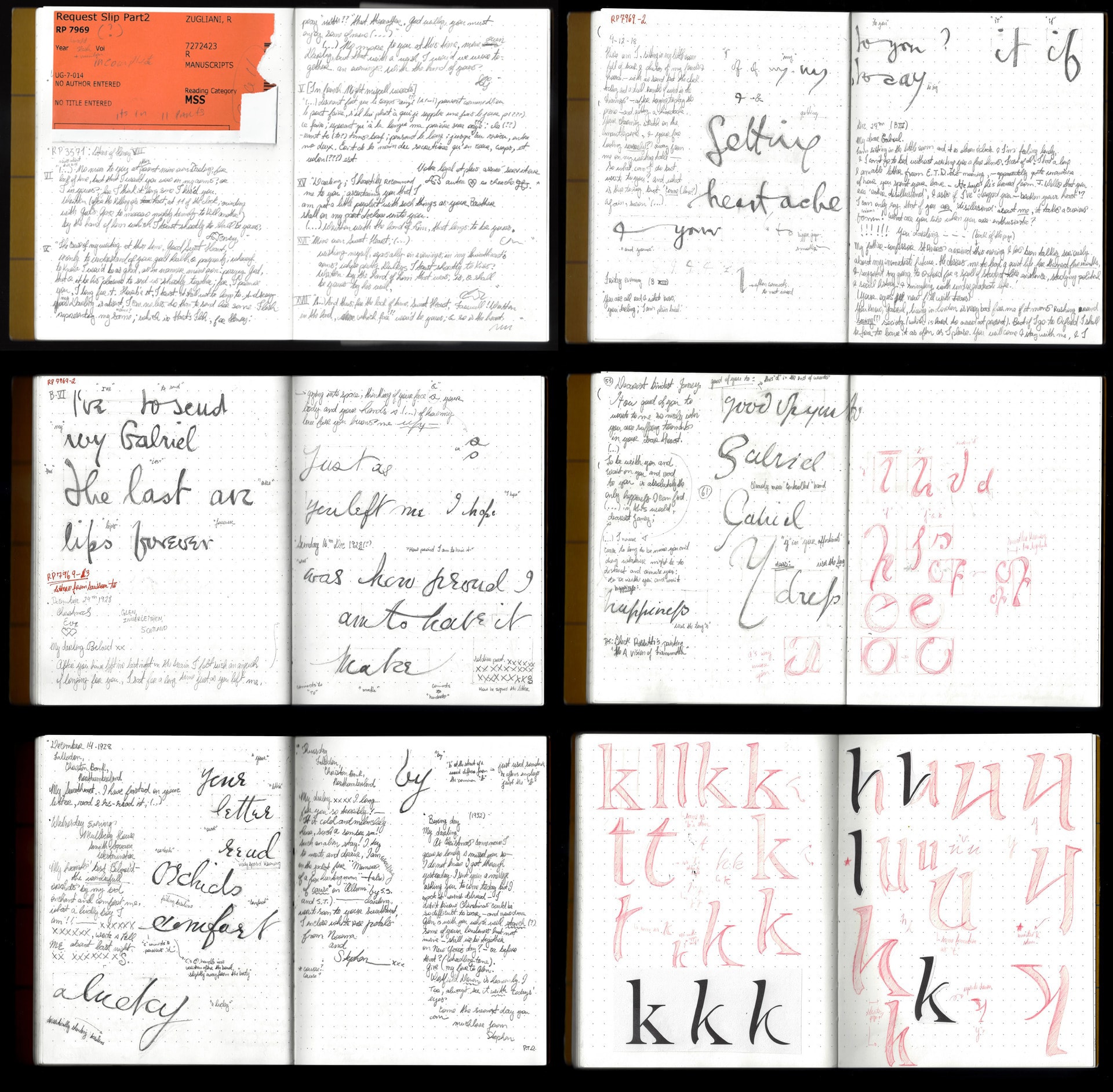
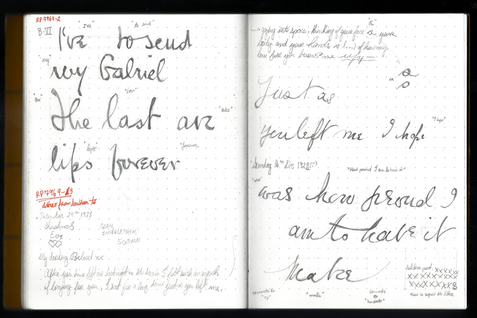
Working in the archives of the British Library, I was not allowed to photograph the original letters. Therefore I deployed my tools and methods as a designer to document this research as visually as my skills would allow me: by hand copying in pencil various fragments of letters and words from the hundreds of papers I perused.

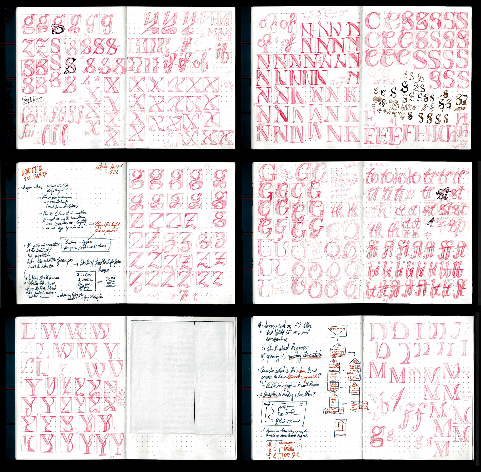
The result was a careful study of the changes in letterforms the more passionate the subject matter was, prompting me to design a typeface to formally recreate such emotional response.

Lovelorn - Typeface, media item 1

With this amalgamation of drawings of handwritten letters and words came the germ of my project: what would it look like if those changes in letterforms were applied to a typeface? Although it might sound counter-intuitive for a typeface to behave like handwriting and portray emotional changes, I ultimately questioned the ‘neutrality’ fonts often boast about. Such musings, however interesting they might be, have little function if there were no reason for such hybrid typeface to exist – there need to be something for which those letterforms could give voice.

Concomitantly I came across a different love letter, this time at the National Archives, that only survives as evidence of a police raid of a gay bar in the West End back in the 1940’s. What made this letter intriguing, however, was the fact it was found torn apart, and it was originally typewritten so it would not be used as blackmail – even the names of the sender and the receiver (Cyril and Morris, respectively) are very likely to be pseudonyms.

The incongruence of reading such a heartfelt confession, as emotional as any of the others I had read so far, not handwritten was only made starker by the monospaced monotony of the infamous Courier typeface. Although written roughly around the same time as Siegfried Sassoon and Stephen Tennant were writing letters to their male lovers, this one from Cyril felt as if it was denied the intimate ‘privilege’ of handwriting, so particular of love letters. Coming from a country with one of the largest number of queer people assassination, such theme resonate deeply with me – and creating a typeface that could give ‘love’ back to such love messages both in the past and present would be a befitting goal to be achieved.

Lovelorn 3, media item 1
Lovelorn 3, media item 2
Lovelorn 3, media item 3
Lovelorn 3, media item 4
Lovelorn 3, media item 5

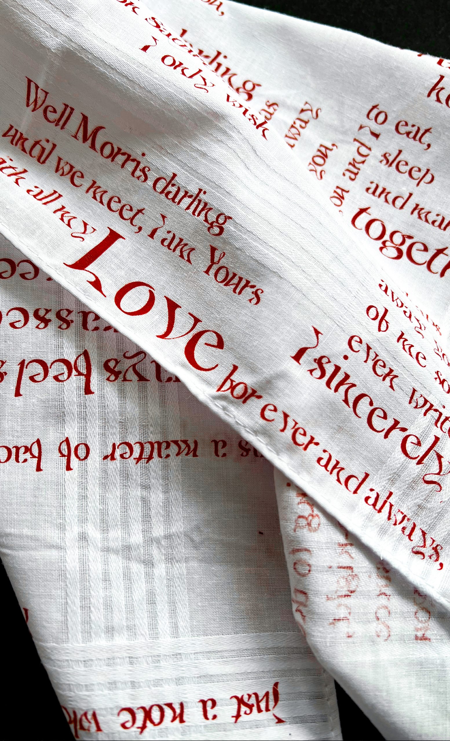
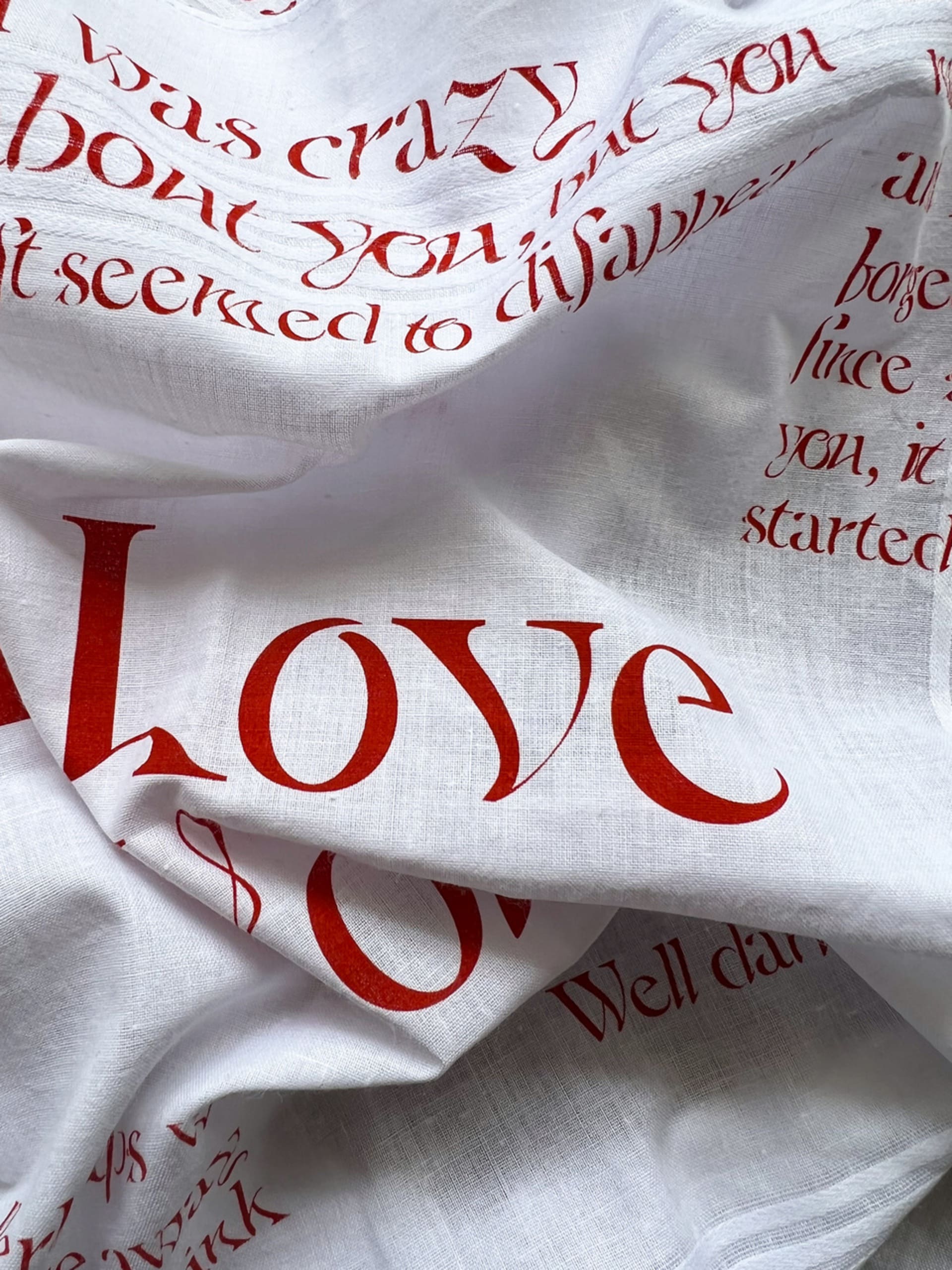
The resulting typeface, Lovelorn, was used to set excerpts of the love letter found at the National Archive on handkerchiefs, functioning as a type specimen. From the coquettish Victorian lady dropping her handkerchief for the chivalrous gentleman to pick up, to travellers waving them from the dock of a ship when departing on their journeys, the handkerchief serves as a prop for its owner to provoke an action or reaction, to communicate a message or intent non-verbally. Its use even stretches out to the gay community in the 80’s creating the hankie code for internal communication.

They also serve an inherently functional role of wiping one’s tears, inevitably linking it to heartbreak and sorrow. At the same time, it is such intimate an object that it even retains its owner’s perfume – thus doubling as a keepsake for a loved one, a olfactive reminder of an absent person.

For the Degree Show, the full text of the typewritten letter was printed on bedsheets which, and paired with a bed installation, defy the concept of a type specimen, taking the typeface from the page to stage, where it can showcase its potential and re-enact the contents of said letter – the remnants of a heartbreak.